
Other Figures
A figure is a visual representation of research results. A reader only needs to glance at a figure to get an idea of the results. A figure is also a good alternative to a text which lists one number after another. This is more pleasant for the reader. Using figures is an effective way to communicate research results. In the table below you will find an overview of frequently used figures and the type of data for which they are suitable. More information about each of the types is also provided.
Table 4.3 Types of figures
| Type of data | Pie chart | Bar chart | Histogram | Line chart |
| Categories (‘type of household) | V | V | ||
| Numerical values (‘number of children’) | V | |||
| Classes (ages ‘31-40, 41-50’) | V | |||
| Development over time | V |
If you copy a figure, table or map from someone else’s work, you must ensure that you do the following:
- Reference the source by stating the name of the author(s) of the relevant article and the year (and also include this information in the bibliography).
- Always include a title. You should use an English title if you are writing your report in English. If necessary, you can add the title to the chart yourself;
- Make sure it is legible. You can re-type illegible titles in Excel. You should always refer to the author(s) of the original chart.
Figure 4.7 uses an indirect reference. Only ‘Brade & Rudolph’ is mentioned in the bibliography.
Figure 4.7 Percentage of people working in the tertiary sector in 1990-1992.
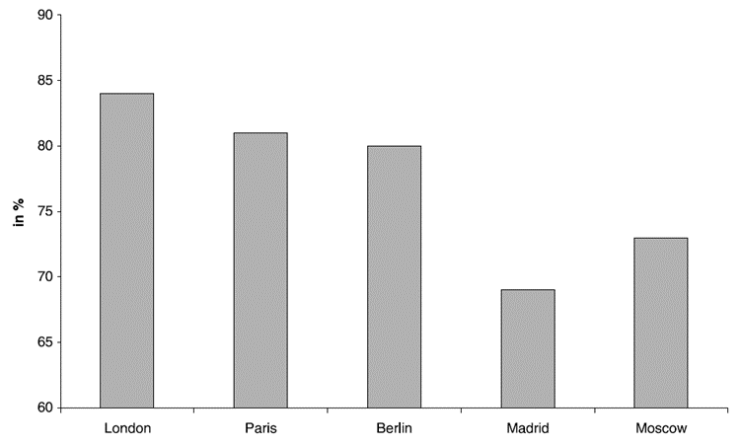 Source: Burdack et al., 2001 in Brade & Rudolph, 2004
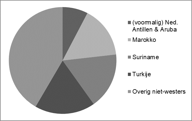
A pie chart is used for categorical variables, i.e. data that consist of a limited number of categories. Each category is represented as a wedge of the pie chart. Together, the wedges form a circle that adds up to one hundred percent. The chart is easier to read if you sort the wedges from large to small.
Figure 4.1 shows the pie chart for the total group of first generation non-Western immigrants (persons born abroad). The wedges represent their distribution by region of origin. Pie charts do not provide exact numbers.
Table 4.4 Origin of first generation non-Western immigrants living in the Netherlands (2012)
| Region of origin | 2012 |
| Marcco | 168214 |
| (former) Dutch Antilles & Aruba | 82693 |
| Suriname | 183752 |
| Turkey | 197107 |
| Other non-Western region | 450235 |
| Total | 1082001 |
Source: CBS Statline, 2013
Figure 4.1 First generation immigrants living in the Netherlands (2012)
 Source: CBS Statline, 2013
- Pie charts are unsuitable if you have more than six categories; you should use a bar chart instead.
- A pie chart is particularly suitable if the categories clearly differ in size (frequency). Use a bar chart for (reasonably) equal frequencies.
- Always start at the top; at ’12 o’clock’.
- Arrange the categories in a logical order, preferably per size (frequency), starting with the largest category (at 12 o’clock). The ‘other’ category comes last. (The order in Figure 4.1 is ‘small to large’ due to the size of the ‘other’ category.)
- Use colours that are easily distinguishable from each other, which are also recognisable when printed in black and white.
- Always give your chart a title, legend and source reference, which should also be listed in the bibliography.
- For clarity, you can also add the relative shares (percentages) to each of the categories, but you do not necessarily have to do this.
Bar charts are used to show the frequency of categorical variables (nominal or ordinal variables). So you indicate how often a category occurs. Examples of such categories are ‘man’ and ‘woman’ or different economic sectors (agriculture, industry, commercial services and non-profit services). The bars on the chart are separated by spaces.
Below you will find an example of a bar chart, which shows the frequency of the modes of transport of 36 theatre-goers. The numbers (frequencies) are on the vertical axis.
Table 4.5: Transport use of theatre-goers in 2016.
| Mode of transport | Number | Percentage |
| On foot | 2 | 5,6 |
| Bicycle | 16 | 44,4 |
| Car | 10 | 27,8 |
| Public Transport | 8 | 22,2 |
| Total | 36 | 100,0 |
Source: Academic Research Project, Faculty of Geosciences, Utrecht University, 2017
Figure 4.2: Transport use of 36 theatre-goers in 2016.
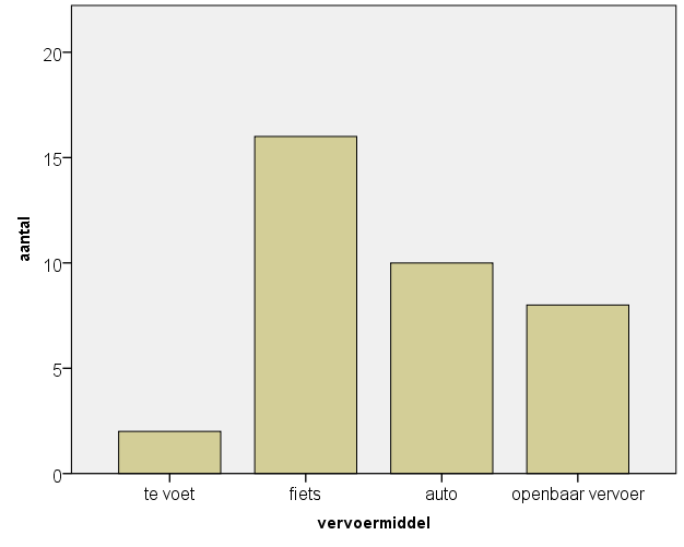 Source: Academic Research Project, Faculty of Geosciences, Utrecht University, 2017
In a bar chart, you can present data from different years side by side (as in Figure 4.3). The categories are on the horizontal axis; the frequencies on the vertical axis.
Figure 4.3 Number of persons employed by sector in 2000 and 2008 in North Brabant
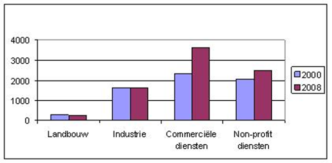 Source: CBS Statline, 2010.
Finally, you can also use a bar chart to display relative frequencies. For this, you should use
a stacked bar chart. For example, you can show how the distribution in year A differs from the
distribution in year B. If there are minor differences in the distribution at time A and time B, a
stacked chart is unsuitable. Note: it is not possible to show absolute growth; at all times, the
total of the distribution is one hundred percent. See the example below (Figure 4.4). The
percentages are on the vertical axis. The total number of employees is equal to one hundred
percent. The relative share of each sector is equal to its share of the bar.
Figure 4.4 Number of persons employed by sector in 2000 and 2008 in North Brabant
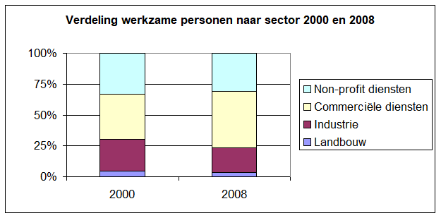 Source: CBS Statline, 2010.
- Do not include too many categories. Ideally you should limit yourself to 4-8 bars, but you
should at least use fewer than 20. - Always insert spaces between the bars.
- Never use 3D bars; they distort the information.
- Put the categories in a logical order: ordinal categories descending or ascending;
nominal categories by size (frequency), alphabetical order or other qualitative
characteristic. - Make sure the chart is functional and uncluttered. Use a light (white) background and
limit the number of grid lines, units, etc. - When creating your charts, always use colours which are easy to distinguish from one
another. They should also be recognisable when printed in black and white. - Always give your chart a title, label both axes and provide source references, which
should also be listed in the bibliography.
A histogram is very similar to a bar chart. The difference is that the bars on a histogram are
next to each other without spaces in between. And instead of using categories or whole
numbers, you use classes. The classes all follow on from each other, as do the bars in the
chart (no spaces between them). Once again, the frequency is on the left axis. Under the bars
you either state the class boundaries or the class midpoints, e.g. ‘4.5’ instead of ‘0-9’. See
Figure 4.5 for an example with class boundaries.
Figure 4.5 Number of employees per contracting firm in 2017
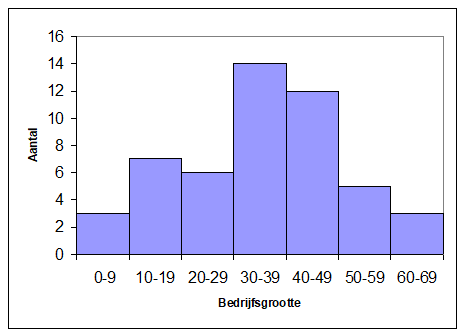 Source: Academic Research Project, Faculty of Geosciences, Utrecht University, 2017
You only use line charts to show a development over time. The horizontal axis is always a
time unit (months, years, decades, etc.). The intervals between the time units must be the
same (e.g. 1900-1910-1920, etc.), otherwise the line between the points gives a distorted
picture of the trend. The vertical axis can have absolute or relative numbers. See Figure 4.6
for an example.
Figure 4.6 Unemployment rates in the Netherlands 2002-2016
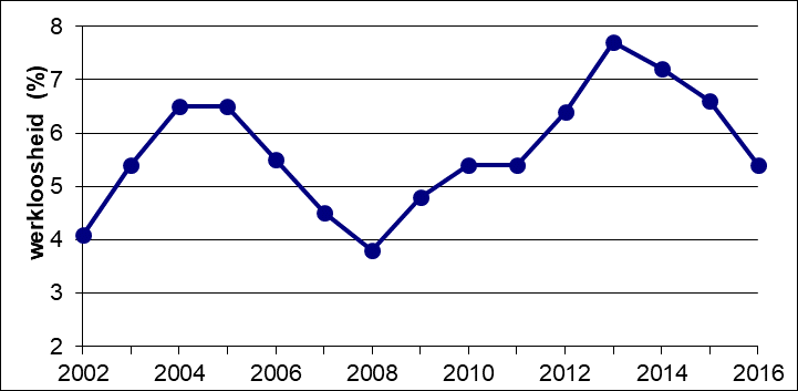 Source: CBS Statline, 2017.